
Turbonomic—IBMSearch & Inventory
Role: UI/UX Designer
Tools: Sketch, Invision, Zoom, Excel
Project Overview
Turbonomic is a Virtual Machine and Cloud resource management software. It was originally created using a Flash based UI. A few years prior to the sunsetting of Flash by Adobe, the Turbonomic product team started transitioning onto an HTML based UI. However, adoption of the new UI by existing customers was extremely slow, due to a few missing features.
Problem
The Implementation team was having a difficult time transitioning existing customers from the Flash UI onto the new HTML UI. One of the major feedbacks was that the new "Search" view did not function as a replacement of the original "Inventory" view, this made searching and discovering resource entities very difficult.
Solution
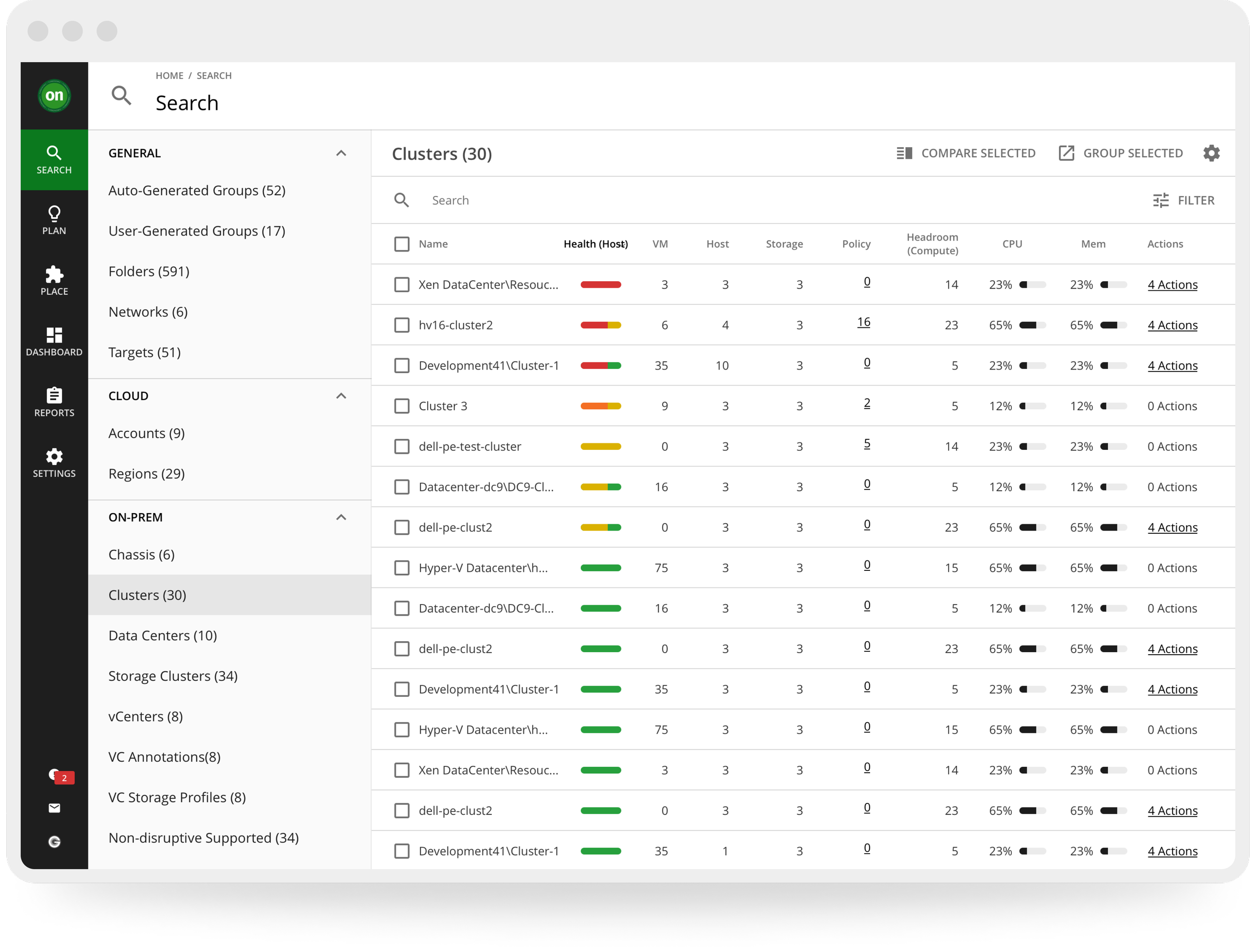
The resulting design was very different from the original ask by the internal stakeholders. However, the new design was significantly better at meeting the needs of the customers, and had also become the basis for many other features, such as the new "Action Center" that would be implemented a year later.
Discovery
Stakeholder Interviews
To understand the specific issues that needed to be addressed, the Project Manager (PM) and I spoke with various stakeholders. Since the company culture at the time limited direct contact between the Product teams and the customers, this meant solely the internal team members, including the Implementation, Sales, and Development teams.
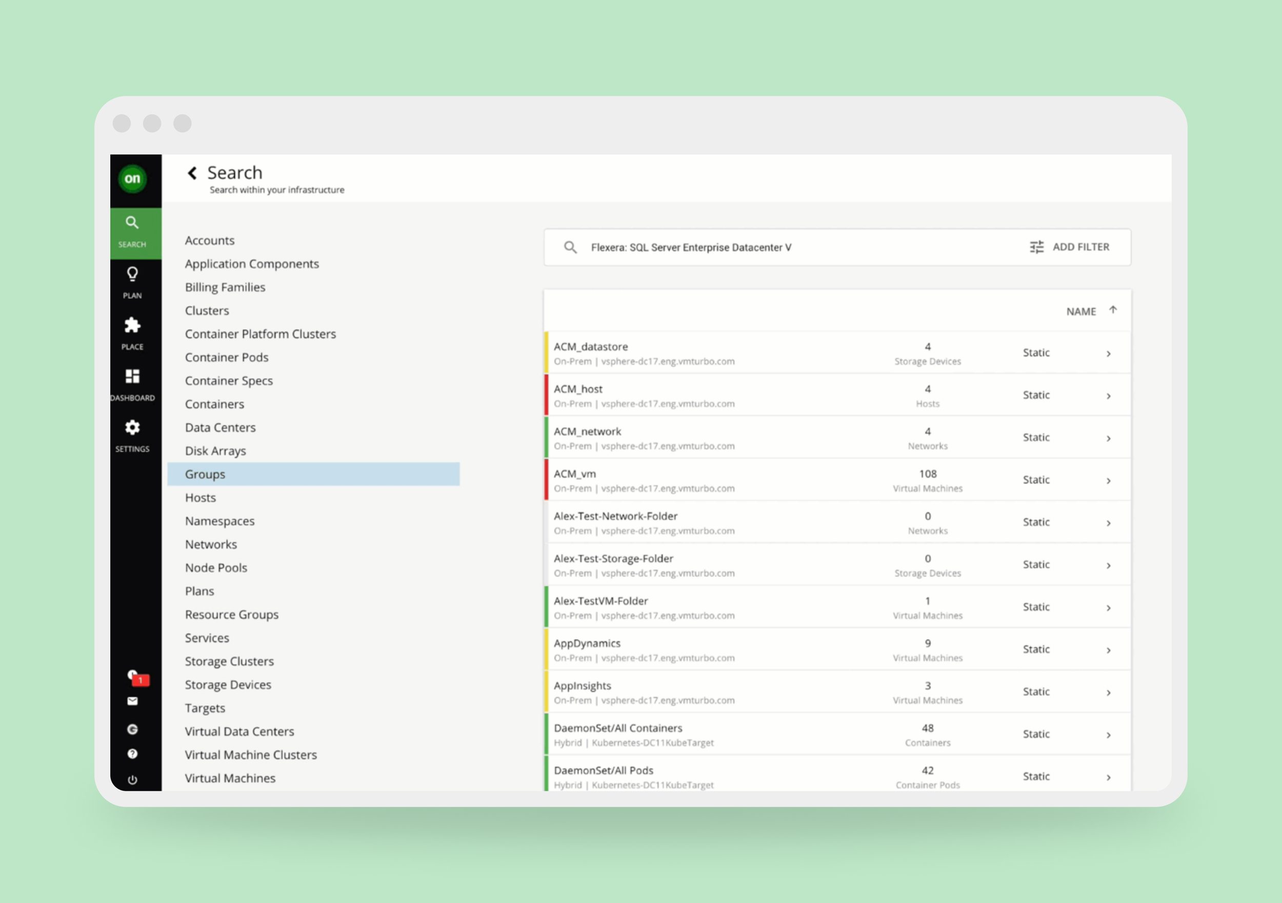
Right: Above: This was the original HTML design that was meant to replace the Flash Inventory view. It was extremely unpopular.
Interview Takeaways
There seemed to be a consistent set of pain points that were brought up by the stakeholders. All of which could be distilled down to three issues and two asks.
Three IssuesThe new "Search" view only presented a flat list of entities grouped into different types, which made understanding relationships between resources within the environment difficult.
Search only matched exact name of the entity.
The "Search" view did not present enough relevant resource status about the entities for decision making.
Two asksBring back the nested folder structure that allowed navigation between different resource types possible.
Bring back the icons that helped to indicate various resource statuses of the entities.
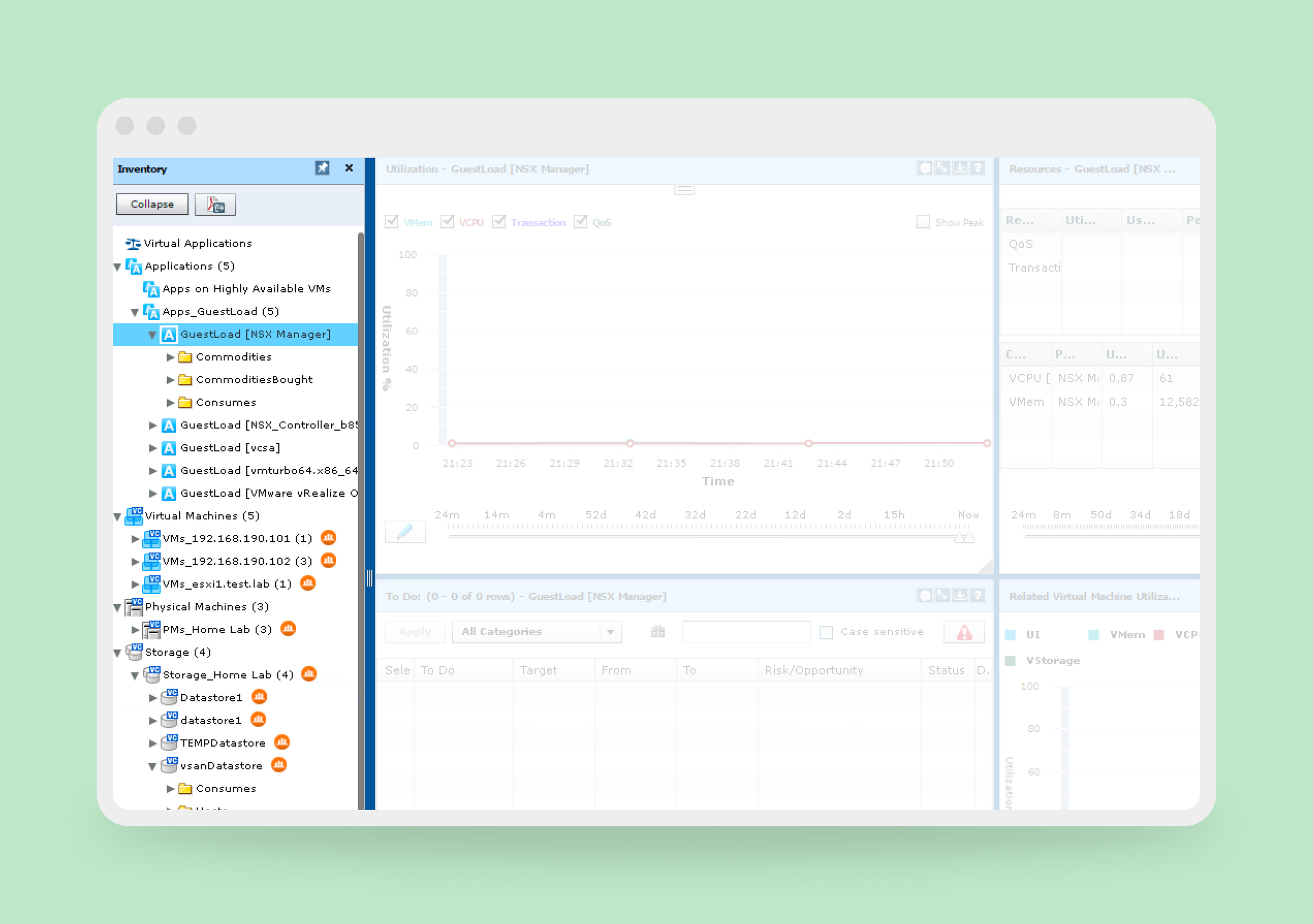
Above: This is the original Flash interface for the Inventory view. The stakeholders wanted to bring back the navigation system in the left panel.
Design Phase One
The initial designs started with honoring the requests of the Stakeholders, and focused on bringing back the nested folder organization and the status indicating icons. However, we quickly realized that these design attempts were faced with some critical technical and design challenges:
The nested folder structure would result in infinite navigation loops that quickly drained browser resources.
Status icons are not universal and difficult to understand.
Stakeholders were not in agreement in terms of which resource statuses are the most relevant to expose, and varied based on use cases.
Inclusion of dashboard views became a part of the ask for more status exposures, which also contributed to browser resource drain.
The design request became a growing list.
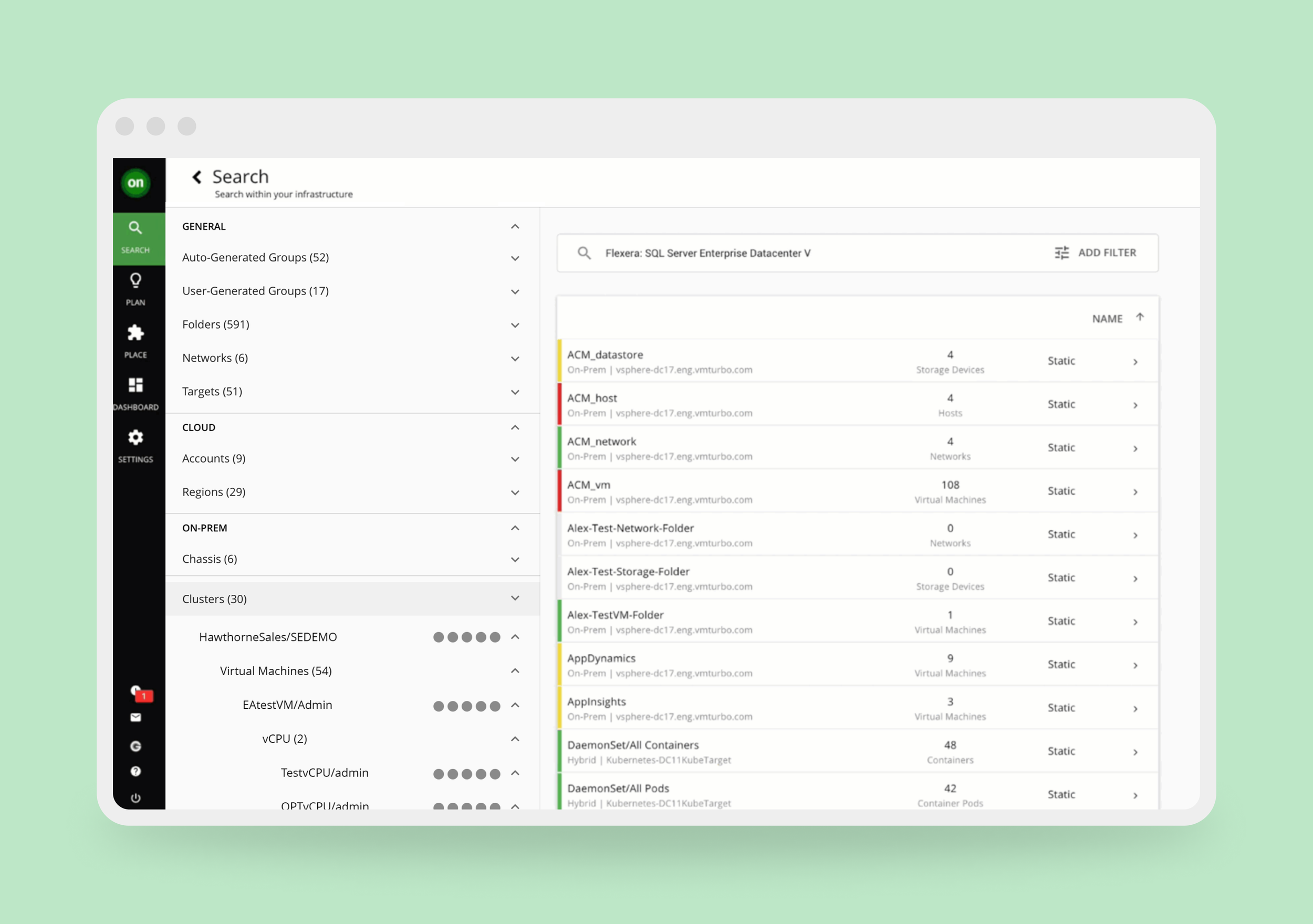
Above: The first set of designs tried to imitate the original flash interface,
A Turning Point
We had a difficult time resolving the design between the technical needs and the internal Stakeholder requests. The PM and I both agreed that we needed to bring the design in front of customers and get proper feedback from them.
Customer Interviews
As designer-client interviews would be a new process, the design phase was paused as we took time to gather an approved client list and prepare for the interviews. We spoke to a total of twenty-two customers over a period of 4 months spread into three different rounds of feedback sessions. Some of the feedback confirmed what we already knew, while others were surprising to hear. The interviews were generally structured into three segments:
Initial questions to gain insight to some of the pain points of the "Search" view.
A walk-through of the new design mockups.
Answering questions and gathering feedback about the designs and what's missing.
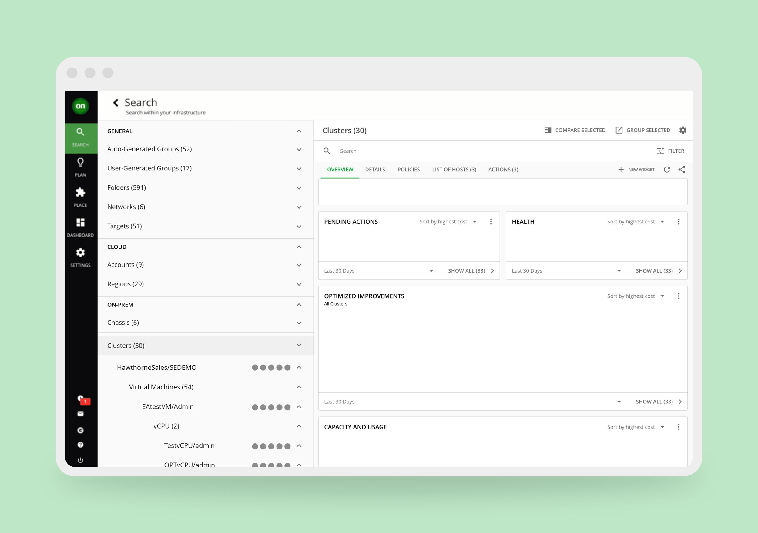
Above: As part of of the user testing, we experimented with replacing the list detailed view on the left side with a dashboard to display more data about the selected resource. The feedback was mixed.
What We Learned
1
Lack of at-a-glance display of relevant data for each entity made scanning through all of the entities difficult.
2
It's important to navigate by resource types or groups, but it was not necessary to navigate directly between them.
3
Better organization of the resource types and groups were needed, especially for those with hybrid environments.
4
Search based on exact name match was not enough. Filtering and sorting features based on resource statuses are needed.
5
Icons and symbols were not sufficient to represent resource statuses, as they were not universal and not enough in numbers.
6
The ability to compare the dashboards between different resources of the same type would be a nice-to-have.
A New Direction
Once we've digested the information from speaking to the customers directly, we've formulated a new plan to tackle the issues from several different fronts.
Create a new and improved filtering experience that includes the relevant filter parameters.
Introduce a more well rounded list of resource types that includes resource groups to allow better organization and faster browsing experience.
Move away from dashboard display of resource stats, and introduce a new method that allows for faster browsing, ease of comparison, and an integrated sorting mechanism.
Integrate an already existing dashboard browsing feature as part of a detail comparison mode.
Design Phase Two
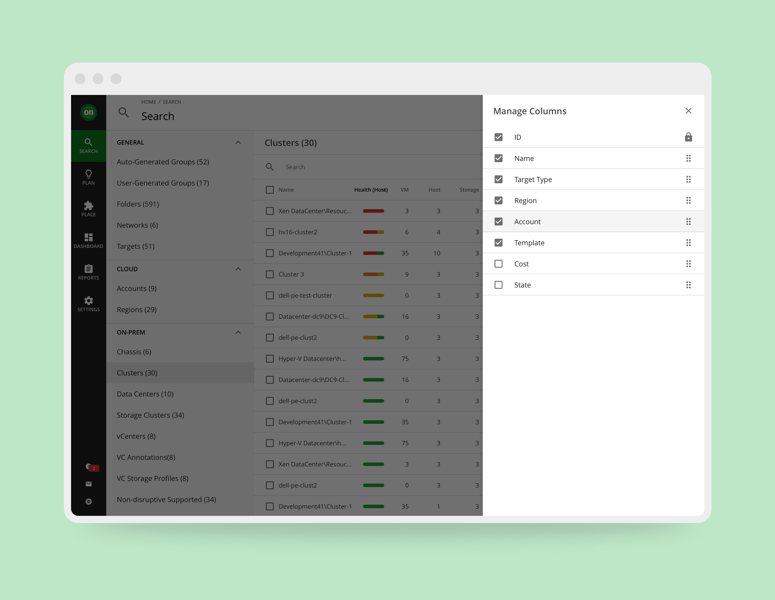
Most of our plans were fairly easy to implement, as they were mostly improvements using what already existed, including the new filtering experience, which I was designing as a part of another project that was running in parallel. What remained was the alternative to the dashboard view of the resources.
Introducing Tables
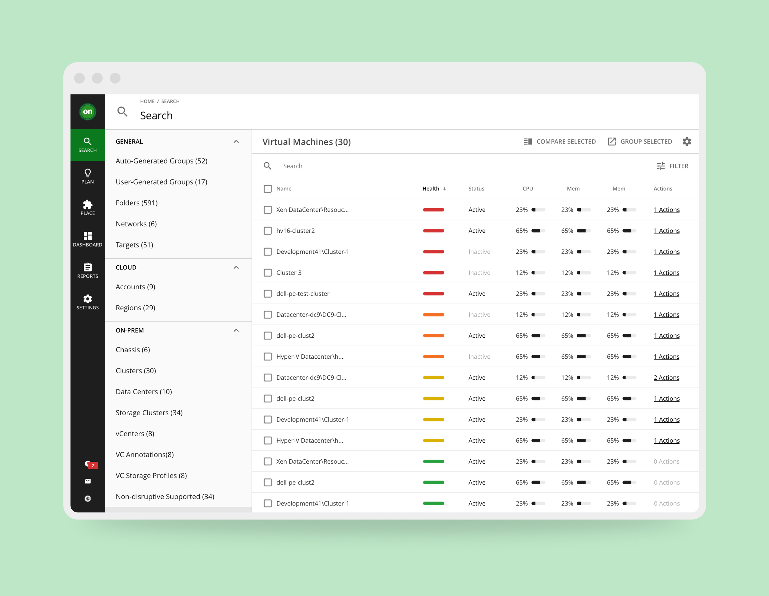
From the customer interviews, we realized unified lists and dashboards, including simplified ones, would not be sufficient in meeting user needs. The PM and I decided to focus on a new UI element that had never been implemented outside of dashboard widgets—Tables. This would address multiple pain points, like data density, sorting of data, and browser performance.
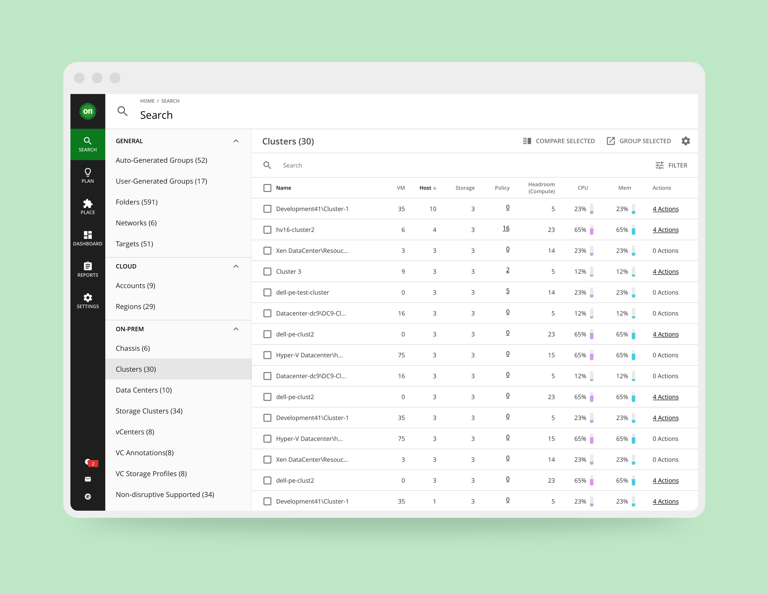
Above: The initial table design had included the basic statuses of the resources, and displayed capacity bars vertically with bright colors.
Design Testing
We went through three more rounds of design and testing that allowed us to confirm the usability of tables, and refined some of the UI elements. Because this is a completely different direction from the original parameters of the project, we included both internal stake holders (Implementation, QA and Sales) and fourteen different customers.
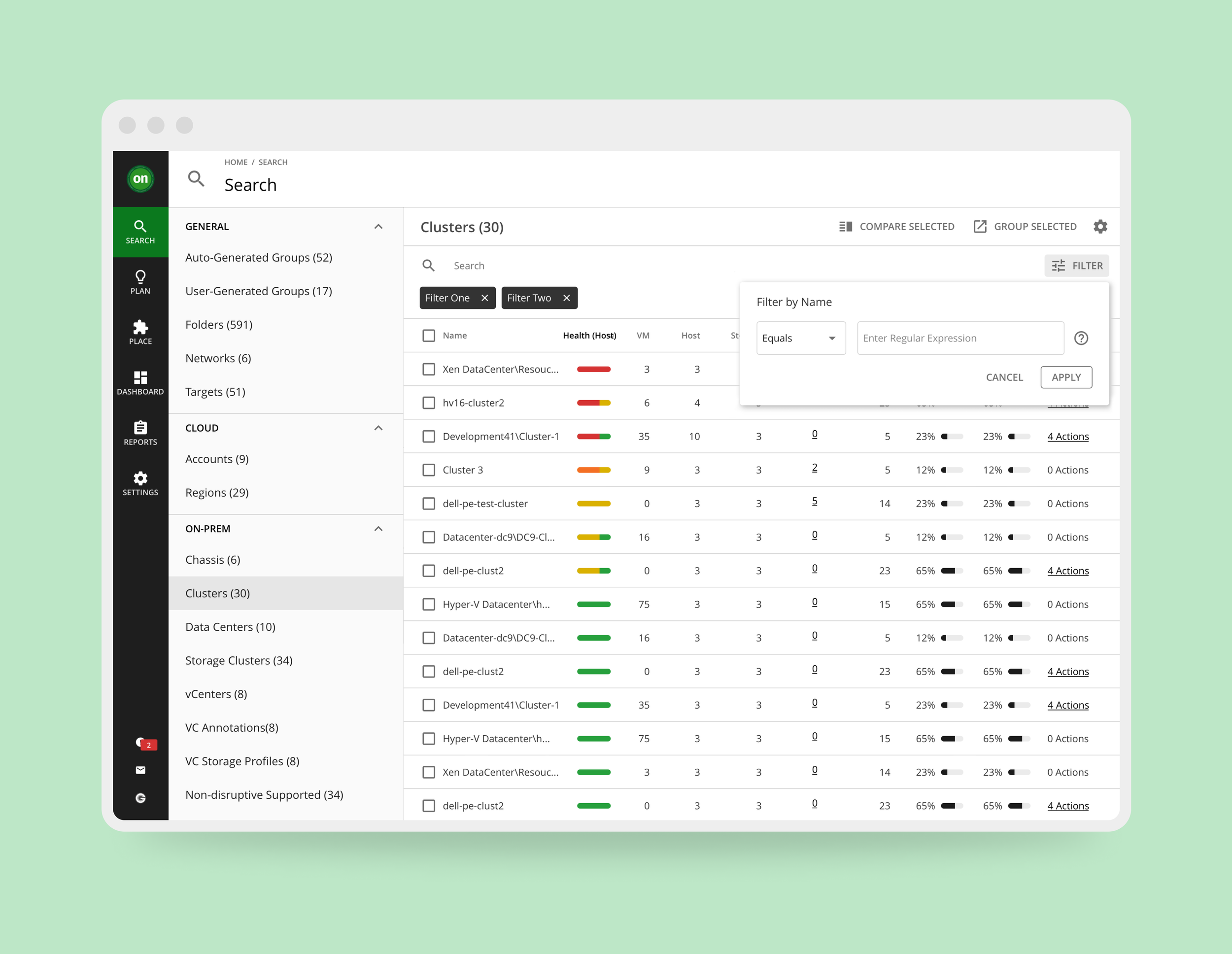
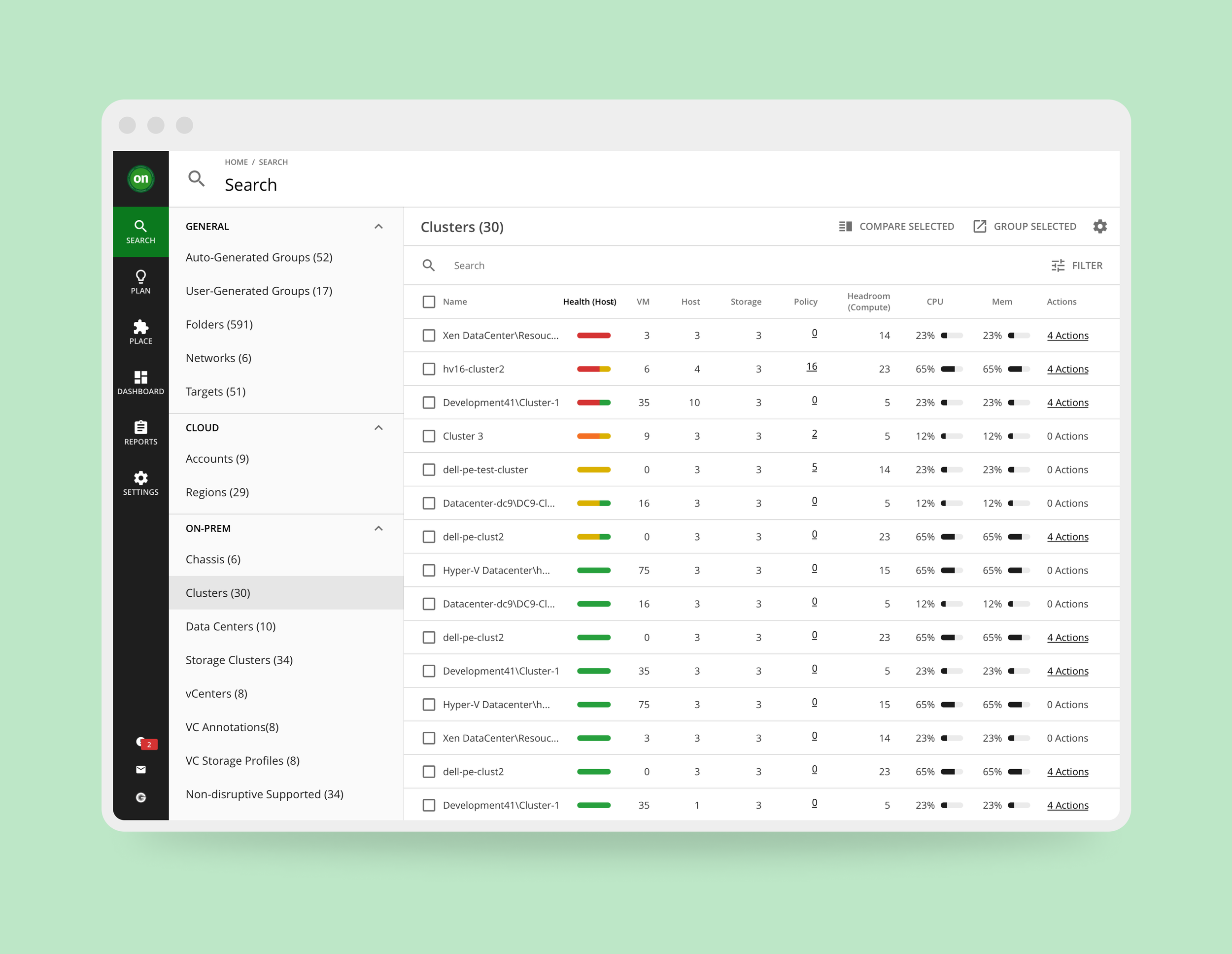
Left: Above: After several user testings, a "Health" column was added by request. The capacity bars were rotated to be horizontal for easier scanning, while the colors were removed due to distraction.
Roadblocks & Resolutions
When we presented the new designs to both the front-end and back-end development teams we faced quite a bit of pushback. Since tables were never part of the original discussion when transitioning from Flash UI to HTML; the data structure of the software was not designed to handle the amount of API calls needed to present the dense amount of data while also supporting the needs of sorting and filtering. The lift that's needed to reorganize the data architecture was too large for the development cadence they were used to.
Fortunately, Turbonomic was moving towards adopting a more “user centric” philosophy. This meant development teams can define their timelines based on project needs, rather than a set cadence that severely limited a project's design scope. With this, we were able work with the development teams to redefine the project timeline in order to accommodate the extra development time. It also allowed me to work with the front-end UI developers to adopt a new table library that met our needs in a scalable way.
Select Final Designs
36
Customers Interviewed
42
Usability Tests
11
Rounds of Design
Final Thoughts &
Pivotal Changes
Overall, the design solution to this project was relatively simple. However, the impact it has made was quite monumental. Tables have now become an integral element of Turbonomic's UI library, and are integrated as the basis to many important features, including the Action Center. A new initiative was also created to establish our own SDK library, as it was very evident that limitations from UI libraries should not be a driving factor in design solutions. Yet, the most important change was in the product design process. The user interviews and the process of user testing proved their own importance in defining product solutions. We also learned from the mistake of not including all development stake holders early in the process, in order to avoid pit-falls during design hand-offs. All of this drove fundamental changes in the design process for the better.